Code in R
library(tidyverse)This site is designed to describe the branding guidelines that the Research Team at EL Education follows, as well as provide ways in which R can be used to construct visualizations and reports.
Throughout, code blocks will be interspersed that show how basic datasets provided with the tidyverse can be used to construct graphs that follow EL’s Style Guide.
The champion fonts used for short and long pieces of text are Mercury and Mark Pro. As each font is proprietary and used primarily by our Creative Team when they are composing in Adobe Illustrator, other teams at EL, including the Research Team, uses analogous fonts that are easier to find and use in Office, Google Docs, and R, which are approved by Creative for our work.
In place of Mark Pro when using longer pieces of text, it is recommended to use Garamond. For constructing charts, tables and other data visualizations, it is recommended that Poppins is used in place of Mercury. Instructions for loading Garamond as a main font in a pdf or html document (as it is on this web page), as well as Poppins for visualizations, are below.
If you wish to write something longer and wish to use Garamond, this can be easily done by adding it to the mainfont part of the heading at the top of a Quarto document, where you list the format (example below).
For charts, and tables, it is easy to add and then call the Poppins font using the showtext library, which was designed for this purpose.
Whenever you wish to construct visualizations in line with EL’s brand guide (especially if sharing externally), you must first run the following piece of code. This will call the showtext package, ask it to load the Poppins font, and then prepare the font to be applied to any visualization you construct.
Once you have done that, it is as easy as changing the font in the theme part of a plot, as you would for any other element.
library(cowplot)
cowplot::set_null_device("agg")

graph1 <- diamonds |>
  ggplot(mapping=aes(x=cut)) +
  geom_bar() +
  theme_bw() +
  labs(title="A Regular Graph")

graph2 <- diamonds |>
  ggplot(mapping=aes(x=cut)) +
  geom_bar() +
  theme_bw() +
  labs(title="A Regular Graph in Poppins") +
  theme(text=element_text(family="Poppins"))

plot_grid(graph1, graph2)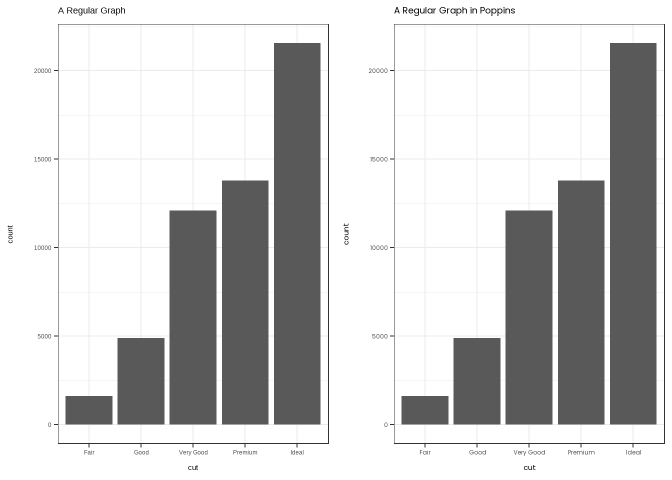
Our primary and secondary colors reflect our history and spirit. In particular, Crimson reflects our founding at Harvard University, while our secondary colors include bright, natural tones to capture the spirit of EL Education that is adventurous, energizing and joyful, as well as neutral tones to capture a reflective, academic spirit and evoke our respect for the natural world.
A color palette showing our primary and secondary colors can be found below.

Crimson represents EL, and should be saved only for elements of a graph that are specific to our partners (e.g., in comparison EL Credentialed schools to their district and state). It should not be used, for instance, in describing a group of students, as that passes a value statement that certain students may be more “EL” than others.
There are three fundamental use cases for color in data visualizations: (i) we can use color to distinguish groups of data from each other; (ii) we can use color to represent data values; and (iii) we can use color to highlight. The types of colors we use and the way in which we use them are quite different for these three cases.
– Claus Wilke, Fundamentals of Data Visualization
While we are free to use the EL palette for cases (i) and (iii) as appropriate, (ii) is trickier because our choice of color should match the type of data that we are representing. As such, we can use the EL palette as a base, using certain packages within R, to create other palettes that more appropriately represent the data we are visualizing.
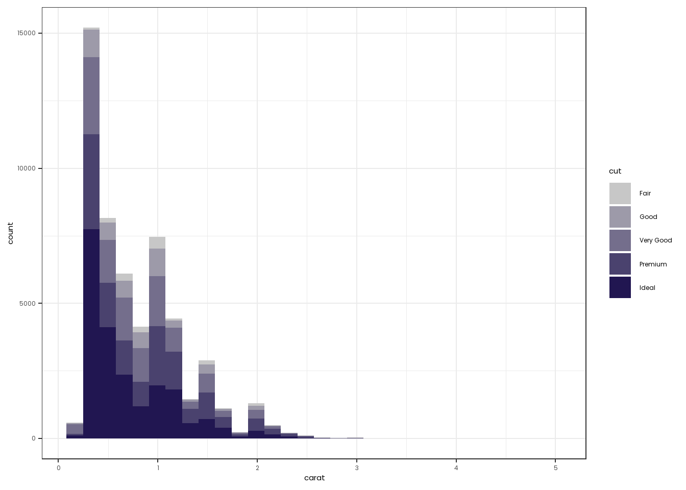
Sequential palettes are used when visualizing continuous or ordinal values that go from low to high (or high to low). For example, if we wanted to create a barplot of the number of students scoring from 100-150, 150-200, and 200-250 on a reading assessment.
In these cases, use Dark Navy, Orange, and Sky Blue, as end points, starting each time with Gray.
One can use colorRampPalette from the RColorBrewer library to create a discrete palette using these end points, and then use scale_*_manual to color the graph if it is discrete. If it is a continuous variable, one can just use scale_*_gradient (where * is fill or color) to color the graphs. Two examples below, with code.
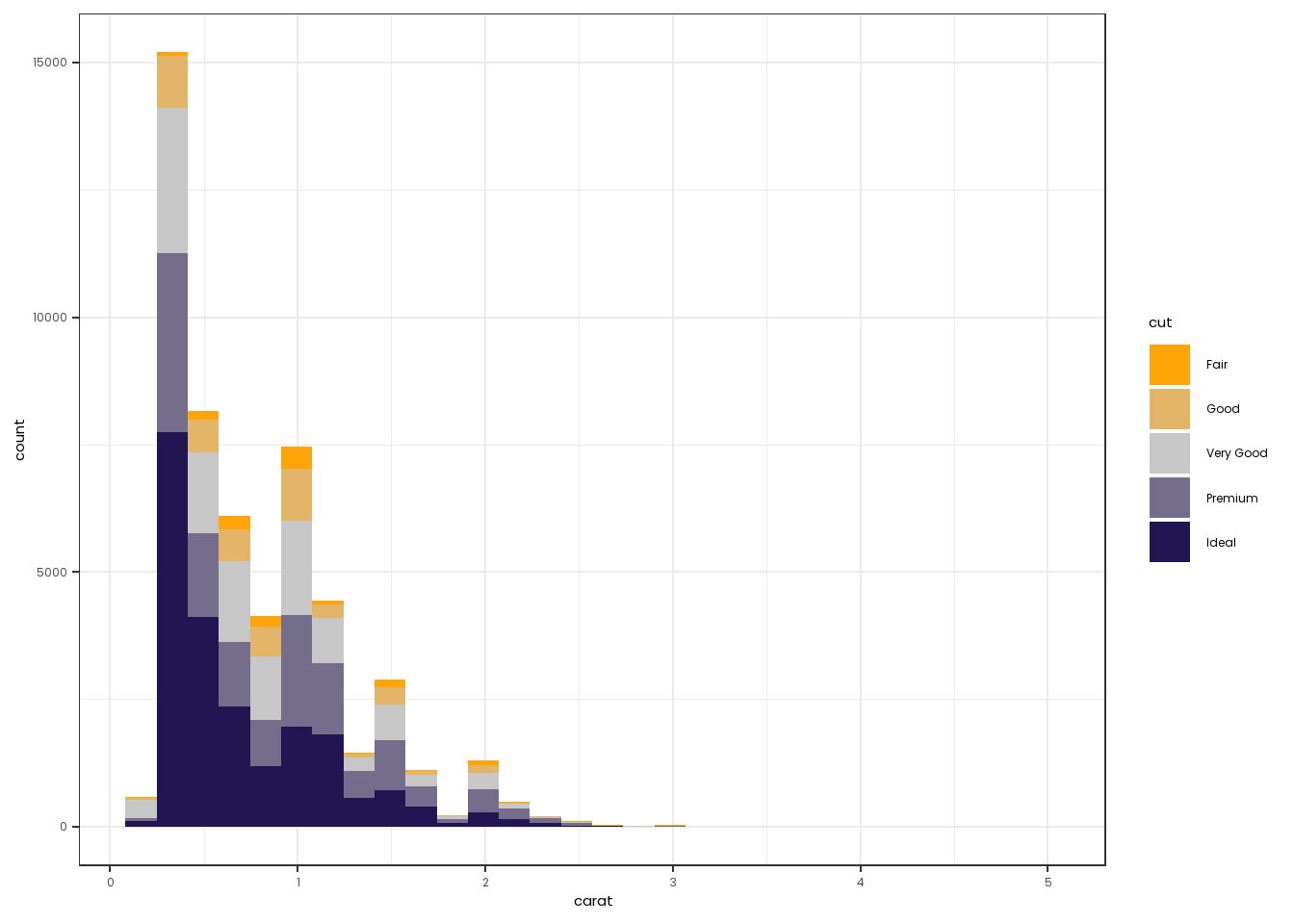
Diverging palettes are used when you are focused on visualizing data with an emphasis on looking for patterns outward from a critical midpoint of the range (often 0, but in ordinal data this could be reading at grade level, for instance).
In these cases, construct a palette from Orange to Dark Navy, going through Gray.
Note that you still use colorRampPalette for discrete data, but now use scale_color_gradient2, which allows you to set a middle color as well as a midpoint. An example of a discrete and continuous divergent dataset are below.
## This constructs a new dataset that shows the price of diamonds on average in comparison to the overall average
diamonds2 <- diamonds |>
  mutate(middle=mean(price)) |>
  group_by(cut,color,middle) |>
  summarise(price=mean(price)) |>
  mutate(price=price-middle)

diamonds2 |>
  ggplot(mapping=aes(x=color,y=price, fill=price)) +
  facet_grid(~cut) +
  geom_col() +
  theme_bw() +
  scale_fill_gradient2(low= "#ffa409", mid="#c7c7c7", high="#211651", midpoint=0) +
  theme(text=element_text(family="Poppins"))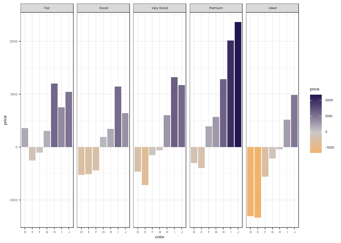
In situations where one needs a palette for categorical or nominal data that is unordered, it is appropriate to use the EL palette outlined above in Figure 2
Two things to keep in mind:
colorblindr package can convert any graph constructed in ggplot2 into a set of graphs as it would be viewed by people with different forms of color blindness.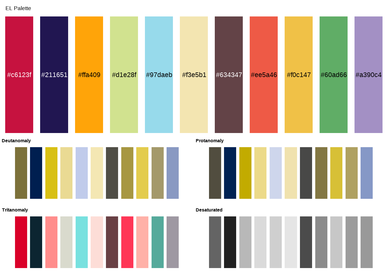
Deutanomaly and Protanomaly are the most common forms of color blindness, so it is useful for external plots to just check. In the graph below, notice that many of the EL colors look similar when plotted through common forms of color blindness.
colorblindpalette <- c("#d1e28f","#f3e5b1","#ee5a46","#60ad66","#ffa409")

graph1 <- diamonds |>
  ggplot(mapping=aes(x=cut, fill=cut)) +
  geom_bar() +
  scale_fill_manual(values=colorblindpalette) +
  theme_bw() +
  theme(text=element_text(family="Poppins"))

graph2 <- cvd_grid(graph1)

plot_grid(graph1,graph2,ncol=1)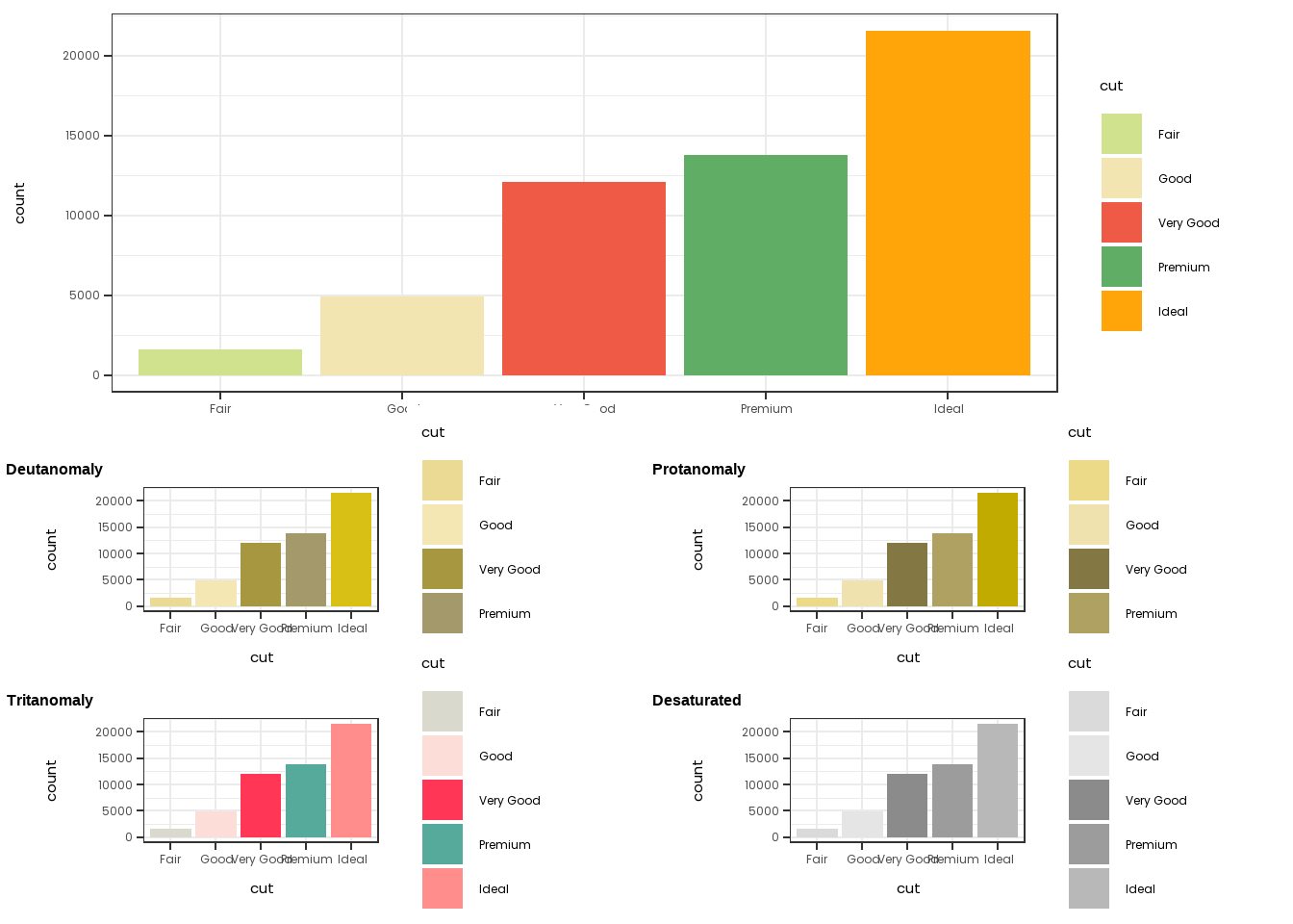
This is not to say that one should not use the EL Palette - just that one should be aware that certain combinations of colors may not be completely appropriate in all settings.
In the rare case where you need a large number of colors and you feel like the EL Palette is not appropriate, it is also possible to look towards the viridis or RColorBrewer packages, where there are existing palettes that are widely used because of their friendliness to color-blindness.
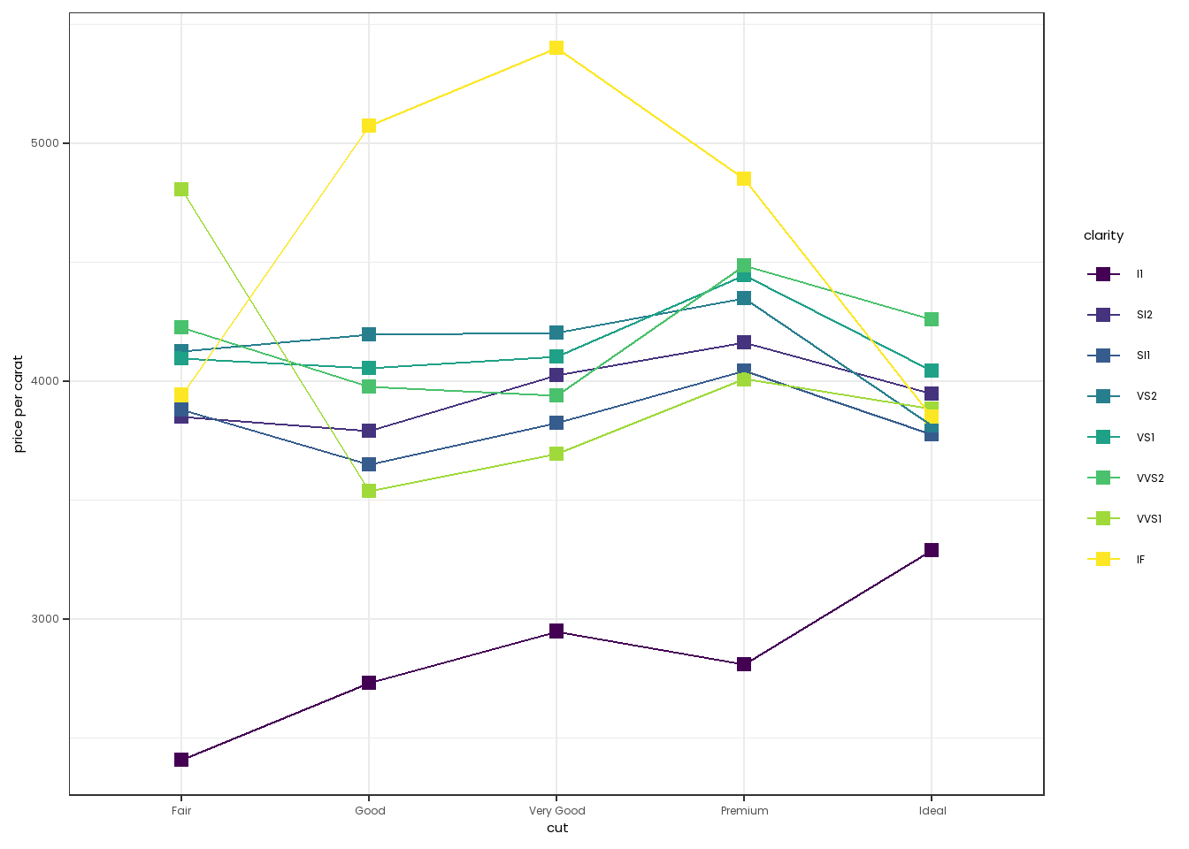
Our style guide asks that, for plots with fewer points, such as some scatter plots, we should use square points instead of round ones. This is controlled using the shape argument of geom_point. 0 is the shape for an open box, while 15 is the shape for a filled in box. One can also change the size of the boses using the size argument.
library(viridis)
diamonds2 <- diamonds |>
  group_by(cut,clarity) |>
  summarise(`price per carat`=mean(price/carat))

diamonds2 |>
  ggplot(mapping=aes(x=cut,y=`price per carat`,group=clarity, color=clarity)) +
  theme_bw() +
  theme(text=element_text(family="Poppins")) +
  scale_color_viridis(discrete=TRUE) +
  geom_point(shape=15,size=2.5) + geom_line()